Values and Vision of the Wheeler Expeditions Family
For any enterprise in life, whether it be a business or a personal cause, values are invariably the cornerstone of any progress. Without strongly defined values, we simply wander about: perhaps achieving some random things here and there, but rarely developing and evolving as a person or organization.
And when it comes to a commercial enterprise, even more important is effectively communicating our values to both current and future clients. If they don’t know what we’re all about, they’ll be unlikely to seek us out to help achieve their goals.
Now just a few months back, I invited my two sons, Brandon and Jackson, to join me in leading incredible adventures around the world – and to my delight, they both accepted.
And with all of this about values in mind, we realized that we at Wheeler Expedidtions hadn’t been communicating our values as effectively as we could, even if they are strongly defined. With our website, logo, colors – with our whole brand, in fact – we weren’t fully expressing our values. Not fully expressing how we change people’s lives through the thrill of High Adventure.
We realized it was truly time for a reinvention of the company I founded 40 years ago.
Mythica Creative
So we went to Mythica Creative, a web and brand design agency dedicated to helping entrepreneurs with true values create their vision for the world. We explained that we wanted our brand to show that our unique, high-end adventure travel services are rooted in family tradition and heritage. In addition, we wanted to fully express our personality, which is both reliable and engaging, trustworthy and exciting.
Together with their help, we created a new brand that beautifully and elegantly expresses our values of living an adventurous life, creating on-the-ground learning experiences, and exploring the world around us.
The WX Logo
A well-crafted logo, we learned, is not only a memorable expression of your services: it is a symbol that stays in your potential clients’ sub-conscious, expressing the class and quality of your services.
We envisioned for our logo a symbol inspiring a thirst for adventure in a contemporary, yet classic style. We wanted the logo to emphasize the tradition, excitement, and stability of the company.
Mythica Creative exceeded our expectations in designing an outstanding symbol that truly captures all of this and more:
In their own words:
Here we combined knowledge of proportions, the relationship between positive and negative spaces, and the classic art of heraldry to craft a strongly recognizable symbol that will stand out in the modern visual jungle. The clean typography resonates beautifully with the main letter, “W”, which we modified to imply the “X” of “Expeditions”. The crest and year of establishment express the tradition and heritage of Wheeler Expeditions’ history.
We particularly enjoyed hearing the story of how the upper crest was inspired by the Wheeler family crest:
First they noticed the parallel between the three leopards and the three Wheelers: myself, Brandon, and Jackson. They then took the central element of the chevron (the inverted V-shape) and created a mountain motif composed of three chrevonels, expresssing both the key role that mountains play in the history of Wheeler Expeditions as well as the three Wheeler men:
Our New Site
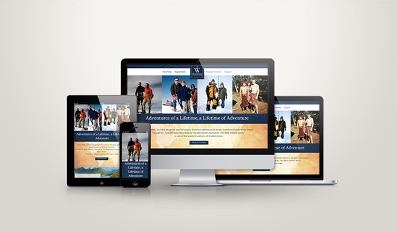
With this strong symbol custom-designed for our needs, Mythica Creative proceeded to build this beautiful, new website.
What I love about what they created is that it’s all centered around the user experience. Instead of being simply a bulletin board for us to announce our newest adventures, it is a visual treat engaging the user and inviting them to explore further.
One key aspect to the fluid user experience is that images are emphasized rather than text: as we all know, a picture is worth a thousand words. However much you describe a place, you’ll never capture its essence in the same way that a beautiful image will.
What improves the user experience even more is that the site is “mobile responsive”: it adapts in shape and size to any device, whether a desktop, laptop, tablet, or mobile phone.
As we learned, this is increasingly important: while in 2015, 52% of internet users were browsing on their mobile devices, now in 2016 that number has increased to a whopping 63%. And because that number is only getting higher and higher every year, the Google algorithm now ranks mobile-responsive websites higher in search results.
So if you’re a business owner looking to attract more clients, improve your website, and increase revenue, consider rebranding with Mythica Creative. We couldn’t recommend them more highly.
The Future of Wheeler Expeditions
Even more exciting is what’s to come.
This rebranding is the first step in taking our company to a new level. Instead of simply leading one-of-a-kind expeditions to breathtaking places around the world, we want to create a tight-knit community of world-class adventurers. We want each of you to know, “You are not a client, you are a member of the Wheeler Expeditions family.”
And with my two sons at my side, the future of the Wheeler Expeditions family is certainly in good hands. All three of us have big plans to create ever more fascinating, ever more exciting adventures to hidden corners of the world. To help more and more people know the thrill of High Adventure. To guide those with an intrepid spirit on journeys of discovery and exploration.
So, are you ready to explore the wonders of this vast Earth? Are you ready to leave the office behind?
Join the Wheeler Expeditions family – and jump into a world of miraculous beauty and rousing adventure!

